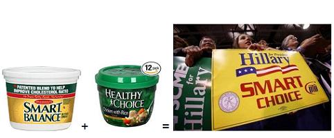
Ben Smith points to an interview with the designer Michael Beirut about the candidate’s “branding,” elements of which are a nice metaphor for the general consistency of his message:
He’s the first candidate, actually, who’s had a coherent, top-to-bottom, 360-degree system at work. Whereas, I think it’s more more common for politicians to have a bumper-sticker symbol that they just stick on everything and hope that that will carry the day.
The thing that sort of flabbergasts me as a professional graphic designer is that, somewhere along the way, they decided that all their graphics would basically be done in the same typeface, which is this typeface called Gotham. If you look at one of his rallies, every single non-handmade sign is in that font. Every single one of them. And they’re all perfectly spaced and perfectly arranged. Trust me. I’ve done graphics for events –and I know what it takes to have rally after rally without someone saying, “Oh, we ran out of signs, let’s do a batch in Arial.” It just doesn’t seem to happen. There’s an absolute level of control that I have trouble achieving with my corporate clients.
Then if you go to the Web site, it’s all reflected there too–all the same elements showing up in this clean, smooth, elegant way. It all ties together really, really beautifully as a system.
Beirut says he’s also “flabbergasted” at the commercial quality of the branding.
“I’m not sure that the commander-in-chief proves his mettle by getting everyone at his rallies to set their signs in the same typeface, but as someone who knows how hard that is, I’m very impressed,” he says.
Update: A friend who’s a brilliant graphic designer writes:
type faces are all copyright protected.
Gotham I believe belongs to chichi expensive type company called Hoefler, so you you have to buy usage, one by one.
It nearly impossible to hack the code to copy, it took me forever.
So…
I would never use a Hoefler font for a large campaign.

