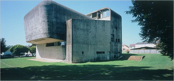
An image of this monstrous French church, L’Eglise Ste-Bernadette du Banlay, assaulted me as I read the NYT Arts section today. Reviewing architect Claude Parent’s work, the Times critic says:
Mr. Parent’s building — massive concrete walls with rounded corners and slot windows — is the expression of a culture living under the constant threat of nuclear annihilation and still haunted by the devastation of World War II.
Inside, two sloped seating areas converge under the light of a long, narrow window running the length of the roof, creating a space of disquieting solitude. The message is ambiguous. Is it a safe haven from the vulgarities of the new consumer society? Or the final resting place for a fixed moral order that is dying out?
Or an ottoman mating with an armchair?
I have a perverse fascination with ugly churches. They’re supposed to lift our eyes toward heaven, and to help us connect to God. It is vitally important for churches to be beautiful, no matter what style (and many different styles can be beautiful … though not all styles are). Given the stakes, when churches fail aesthetically, they fail epically. Consider Our Lady of Chernobyl, in suburban New York, or the Florida church complex that looks like an bologna ziggurat sculpted by Oscar Mayer, next to a giant tortilla warmer. This is what happens when people forget what church architecture and design is for, and when insecure clergy and church lay leadership get fugaboo’d and intimidated by architects who want to make a Statement.
If you have any images you’d like me to share with readers in a Gallery of Regrettable Churches, send me the links at roddreher (at) aol.com rdreher (at) templeton.org — for a limited time.
UPDATE: Submissions for the Gallery of Regrettable Churches are coming in! Look below the jump to see them — I’ll be updating them throughout the day. Do keep in mind that inclusion in the Gallery does not necessarily reflect a judgment on the theology of the church or the fidelity of its members, only an aesthetic judgment on the architecture itself.
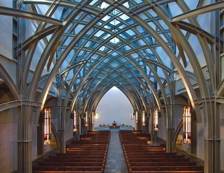
A reader in Dallas submits the Oratory at Ave Maria University in south Florida to the gallery, writing:
It’s not so bad from the outside, but inside the main features are massive steel pillars painted grey. I called it the “battleship gothic” aesthetic – you feel like you are worshipping in a battleship turned upside down.
UPDATE.2 Our faithful correspondent in the Old Dominion submits the Former Episcopal Cathedral of the Diocese of Western Michigan.  Hmm…to me, it suggests the Knights Who Say “Ni” at prayer (see left).
  I wonder why the Episcopalians abandoned this monstrous carbuncle (besides the obvious reason, of course)? This story suggests that the cathedral congregation had dwindled to just over 100 souls at the time it was sold. Anyway, our man writes:
In 2007 the Diocese of Western Michigan sold the cathedral to a megachurch, Valley Family Church, which is now conducting a massive capital campaign to expand the facilities. This brochure gives the best picture of what Valley Family Church envisions for the campus (see especially p. 13). Ultimately it will look like a community college with a Brutalist wing.
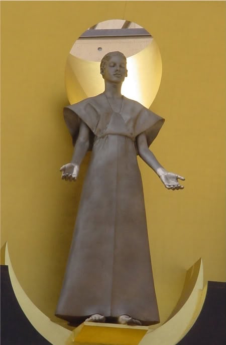
UPDATE.3: A reader submits the cathedrals in both Los Angeles and Oakland as prime examples of modernist/postmodernist grotesquerie — and sends a link with photos of both, and an unfavorable comparison of the cost of these modern churches with contemporary ones built in traditional styles. He submits this photo of a statue of Jesus inside the LA Cathedral, and calls it “Jedi Christ.” A perfect name for this space-age image — except the short-haired, unveiled figure is not Jesus, but his mother, Mary. So it’s even weirder than he thought.
UPDATE.4: Some apparently serious reader claimed in the “What will we say to the aliens?” combox thread today that Jesus was the product of Mary’s mating with an alien, only we’re too dumb to recognize it. I take it that the Gentle Reader is on the vestry at this church:
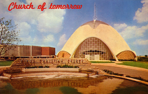
UPDATE.5: Crescat asks: church, prison, factory, or insane asylum? (this was once a contest, but she then edited the entry to reveal the answers; still, it’s pretty funny). Crescat’s examples of fugly church art are also pretty hathotic; I’m especially moved by the Sith Madonna and the Iron Lung Jesus.
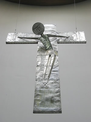
UPDATE.6: Ohhh noooooo! The dear old Dieters in Germany put up a church that, on evidence of its crucifix, is dedicated to the idea that the Romans missed Jesus of Nazareth and got hold of Mr. Bill instead! Look at the interior and exterior of the church where this crucifix is found. You’d sooner find a sign of life inside a meat locker. Yeah, it’d probably be bacteria, but at least it’d be something. 